Flipping
through a book on famous artists,I was
especially drawn to page 308 dedicated to James Rosenquist. Each page showed
only one image of the artists’ work, presumably the most representative of that artists work as a whole.
The image shown for Rosenquist was a classic pop art painting including the iconic manicured nails and red lips he is known for. Looking at this painting, I began to wonder about Rosenquist's relationship with drawing.

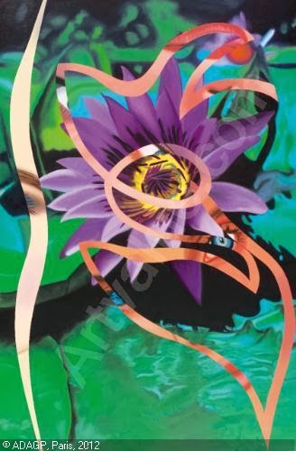
A classic example of Rosenquist's work titled Fahrenheit 1982. Done in 1982, It is oil on canvas, size 33 1/8 by 71 1/2 inches. It is displayed in the Whitney Museum of American Art.
Born
November 29, 1933, in Grand Forks, North Dakota, James Rosenquist became
one of the most renound protagonists in the Pop Art movement. Ronsenquist was inspired by the subject and style of modern commercial culture. Growing up in North Dakota, Rosenquist won won a scholarship to study at the Minneapolis School of Art when he was 14. In 1955, having received a
scholarship to the Art Students League, he moved to New York City. All the
while, Rosenquist supported himself by working as a billboard painter. It was not until 1960 that Rosenquist began to acquire the techniques and iconography
of his commercial work.

James Rosenquist with his mother and an early creation from his sign-painting days in Minnesota
Pop Art refers to the international phenomenon in various cities from the
mid-1950s onwards. Following the popularity of the Abstract Expressionists, Pop Art reintroduced identifiable imagery. This was a
major shift for the direction of modernism. The subject matter became far from traditional
"high art" themes of morality, mythology, and classic history;
rather, Pop artists celebrated commonplace objects and people of everyday life,
in this way seeking to elevate popular culture to the level of fine art.
Perhaps owing to the incorporation of commercial images, Pop art has become one
of the most recognizable styles of modern art. Rosenquist was not concerned with the label put on his work. He once said,
"What
united us was dread of the
drip, the splash, the schmear, combined with an ironic attitude toward the
banalities of American consumer culture. If anything, you might say we were antipop
artists." -James Ronsenquist
Rosenquist
enjoyed the effect of using a billboard style of painting on smaller canvases, where the images became softly blurred and their literal
quality was lost in the close-up orientation and the cropping of the image. He
also played with shifts in scale and technique and juxtaposed a number of disparate motifs in a single canvas. His typical completed painting would be a disjunctive display of various pop
images. Rosenquist also became known for his sculpture work, portraying similar themes and techniques as his paintings but in three dimensions.
***
In a book on the complete works of Rosenquist, I found a small section dedicated to his drawings. I was intrigued. After reading this section, I had learned that the famous Pop Artist James Rosenquist and me (beginning drawing student) had something in common: We both make use of study drawings to better our final work.
This drawing was a study drawing for the final piece, Toaster. What I found most exciting about this study drawing was all the notes Rosenquist took on what he wanted to change, keep the same, and achieve in his final sculpture. The notes also explain to someone, maybe a potential buyer, what the sculpture contains. I especially like the note at the bottom - "Hope to come to Calif. in late Jan or Feb"

Study for Toaster, 1963. Pencil and watercolor on Mylar. 9 x 12 inches.
Toaster, 1963, Multimedia, 9 x 9 x 11 feet
Another drawing of Rosenquist was more developed than the study for toaster. I originally thought it was a fully developed drawing until I read the description. This Drawing is also a study drawing for a piece within Welcome to the Water Planet II, one of Rosenquist's collections. I found it interesting that he originally used only charcoal in the study drawing, and used color in the final.

Study for Welcome to the Water Planet, II. Charcoal on Paper. 60 x 42 inches
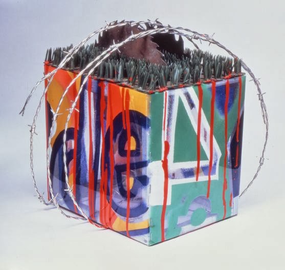
Lastly, I found this study drawing for one of Rosenquist's more famous sculptures entitled Tumbleweed. I found it amazing how accurate the drawing was, as I had never previously considered that a sculpture involved so much study and attention to detail before it is even created.

Tumbleweed, 1964. Pencil and chalk crayon on paper. 22 x 29 3/4 inches

Tumbleweed, by James Rosenquist, chromed barbed wire, neon and wood, approximately 54 by 60 by 60 inches.
I was thrilled to learn more about Rosenquist because he was an artist I had always admired through his Pop Art. Learning about the drawings behind the Pop art made my appreciation for Rosenquist deeper, and my understanding of the value of study drawings even greater.
No comments:
Post a Comment